
The Guide on How to Implement Data-driven Storytelling to Boost Engagement: A Comprehensive Guide
Table of Contents
- Introduction: Why Your Data Needs a Better Story
- What Is Data-Driven Storytelling? Understanding the Foundation
- The Psychology of Storytelling Engagement: Why Our Brain Needs Narratives
- Content Marketing Meets Data: Building a Strong Strategic Foundation
- Visual Data Storytelling: Bringing Numbers to Life
- How to Implement Data-Driven Storytelling: A Step-by-Step Framework
- Common Data Storytelling Mistakes and How to Avoid Them
- Digital Marketing Integration: Extending Data Stories Across Channels
- Measuring the Success of Data-Driven Storytelling: Analytics and Insights
- Conclusion: Turn Data into Stories That Drive Engagement
Make your content memorable rather than forgettable through the power of narrative analytics.
Introduction: Why Your Data Needs a Better Story
Imagine sitting in a meeting where the next presentation is filled with charts, graphs, and figures. The data may be valuable, but within minutes, people start losing interest. The problem isn’t necessarily the data—it’s how the data is presented and the story it tells.
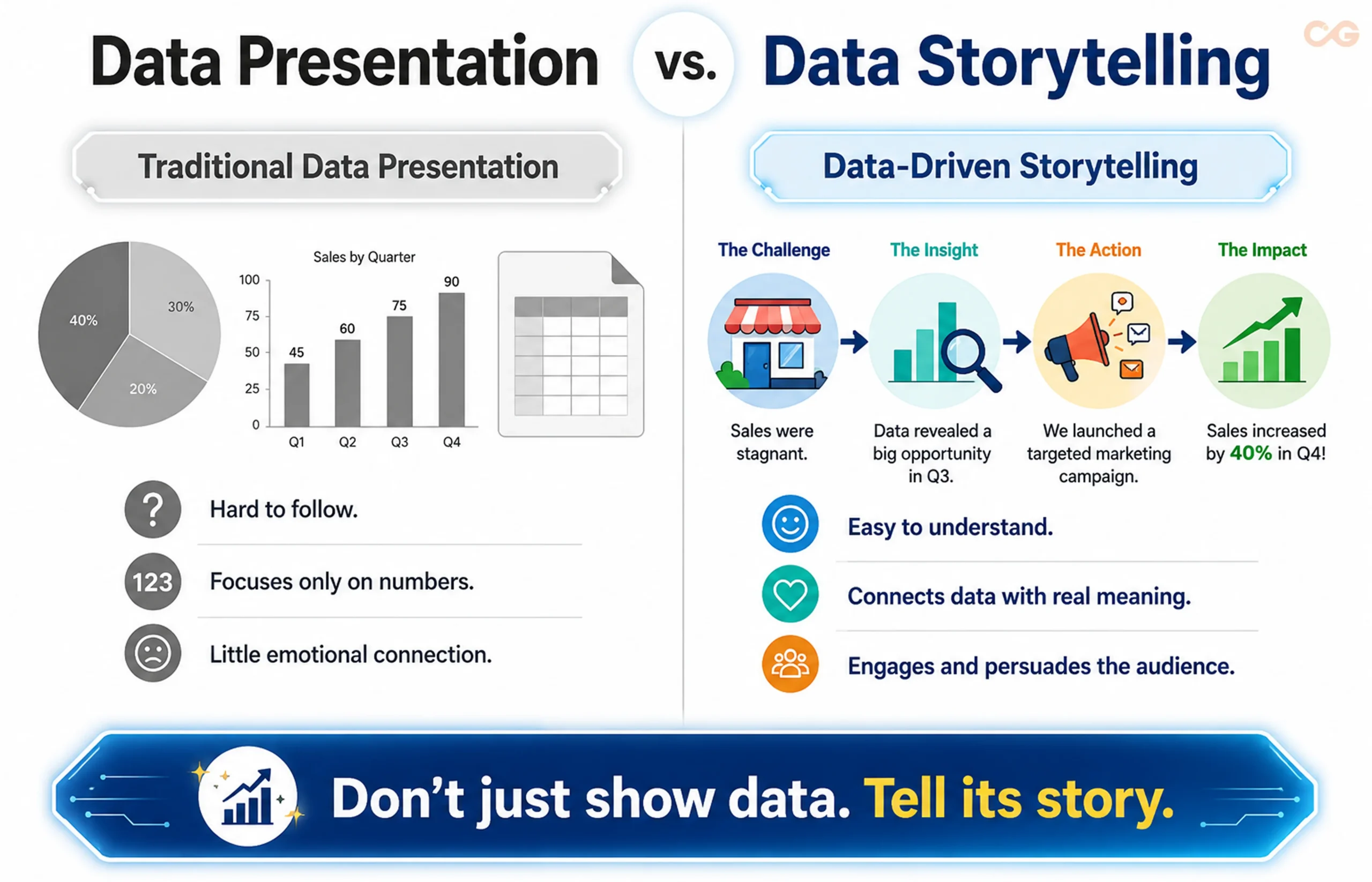
This challenge exists across boardrooms, classrooms, and marketing campaigns every day. Raw data can provide valuable insights, but without context or a compelling narrative, those insights can easily be overlooked. Data-driven storytelling bridges this gap by combining data visualisation and compelling narratives to turn complex information into stories that people can understand, remember, and connect with.
According to Electro IQ, storytelling can increase conversion rates by 30 per cent and improve product perception by 2,706 per cent, highlighting its potential as a powerful marketing tool. But what exactly is data-driven storytelling, and how can you use it to make your content more engaging and impactful?
In this guide, we’ll explore how to implement data-driven storytelling and transform your data into narratives that capture attention and drive engagement.
What Is Data-Driven Storytelling? Understanding the Foundation
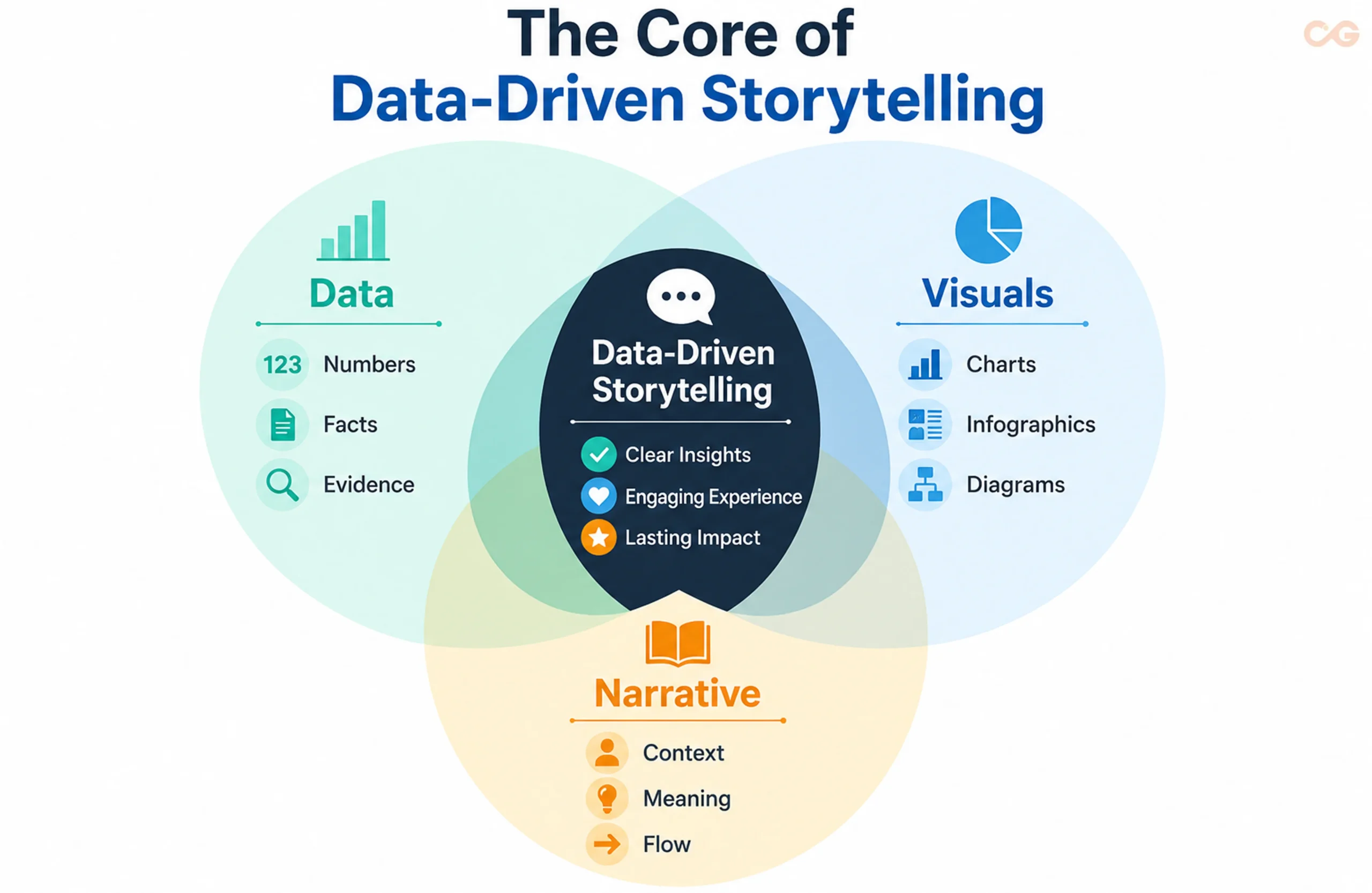
Data-driven storytelling combines three essential elements—reliable data, compelling visuals, and a well-structured narrative—to create content that does more than inform. It helps audiences understand complex information, connect with key insights, and take action. By combining data storytelling with effective data visualisation, businesses can turn complex information into clear, engaging, and memorable narratives.
Unlike conventional reporting, which often focuses on presenting facts and figures, data-driven storytelling places those insights within a clear narrative. This approach, also known as storytelling with data, gives information greater context, makes complex findings easier to understand, and creates a stronger connection with the audience.
The 3 Pillars of Effective Data Storytelling
1. Reliable Data:
Use data that is accurate, relevant, and credible. Strong data provides a trustworthy foundation for your insights, supports effective data storytelling, and helps build audience confidence.
2. Compelling Data Visualisation:
Use charts, graphs, infographics, and interactive elements to simplify complex information and highlight the insights that matter most. It helps audiences quickly identify patterns, trends, and important findings.
3. Strong Narrative Structure:
Organise your information into a clear beginning, middle, and conclusion. A well-structured narrative guides the audience through the data, explains why it matters, and makes key insights easier to remember. This is one of the most important data storytelling techniques for turning information into a meaningful story.
When these three elements work together, data becomes more than a collection of numbers. It becomes a compelling story that gives meaning to insights, captures attention, and encourages your audience to act.
The Psychology of Storytelling Engagement: Why Our Brain Needs Narratives
Humans have always relied on stories to communicate information, make sense of experiences, and remember important ideas. Long before spreadsheets and dashboards existed, oral storytelling helped people pass knowledge from one generation to another. That connection remains relevant in the digital age. When information is presented through a narrative, audiences can engage with both the facts and the context behind them.
The Science of Story Engagement
Neuroscience research suggests that engaging stories can trigger emotional and cognitive responses that strengthen empathy, attention, and connection. Research on storytelling has also linked narratives with the release of oxytocin, a hormone associated with social bonding and trust. This helps explain why narrative marketing can create a stronger emotional connection than presenting facts and figures alone.
The Retention Factor
Visuals and narratives can also make information easier to remember. Dingley Press reports that people remember 65% of information when it is presented with images, while labZ reports 63 per cent when information is presented as a story, compared with only 5 per cent of statistics without visual depictions.
These figures highlight an important principle: data becomes more impactful when audiences can understand and remember it. Combining relevant visuals with a clear narrative can therefore help businesses communicate insights more effectively, support decision-making, and encourage meaningful action.
Content Marketing Meets Data: Building a Strong Strategic Foundation
Data provides a roadmap for modern content marketing by revealing what your audience cares about, what problems they face, and which topics resonate with them. The real challenge is turning these insights into content that feels useful and human rather than clinical or detached.
Finding Your Data Stories
The first step in creating engaging data-driven content is identifying insights that are worth turning into a story. Not every data point needs to become a headline or an article. Focus on findings that:
- Challenge conventional wisdom by revealing that commonly held assumptions may not be accurate.
- Uncover unexpected patterns that change how audiences understand a market, trend, or customer behaviour.
- Support important business decisions with credible, evidence-based insights.
- Address customer pain points by revealing problems that your audience is actively trying to solve.
- Reveal cause-and-effect relationships that show how specific actions can influence outcomes.
The strongest stories often emerge when the data reveals something surprising, useful, or actionable.
Connecting Data with Content
Effective organisations don’t treat data and content as separate functions. Instead, they create a continuous feedback loop: data reveals audience insights, those insights shape content, and content performance generates new data for future decisions.
For example, audience behaviour can help identify which topics deserve more attention, while engagement metrics can show which stories, formats, and messages resonate most. This approach allows content teams to continuously refine their strategy based on evidence rather than assumptions.
Netflix offers a practical example of this approach. The platform analyses viewing behaviour, audience preferences, and engagement patterns to understand what types of content resonate with different audiences. These insights can then inform content decisions, helping Netflix develop and promote stories that are more likely to capture audience interest.
Case Study: Zomato Food Trends
The Approach:
Zomato turned its extensive food-ordering data into engaging insights through its Zomato Food Trends platform. Instead of presenting raw numbers, the platform highlighted patterns in consumer preferences, regional tastes, and ordering behaviour across India.
The Story:
Zomato’s 2023 food trends revealed that Indians ordered more than 10.09 crore plates of biryani, making it the most-ordered dish. Bengaluru recorded the highest number of breakfast orders, while Delhi led in late-night orders. The top eight cities accounted for more than 55% of total Zomato orders.
Key Takeaway:
Zomato demonstrates how data-driven storytelling can turn large volumes of behavioural data into relatable, culturally relevant stories. By connecting numbers with everyday food habits, the brand made its data more interesting and accessible to its audience.
Data-Driven Brand Storytelling: Connecting Data with Authenticity
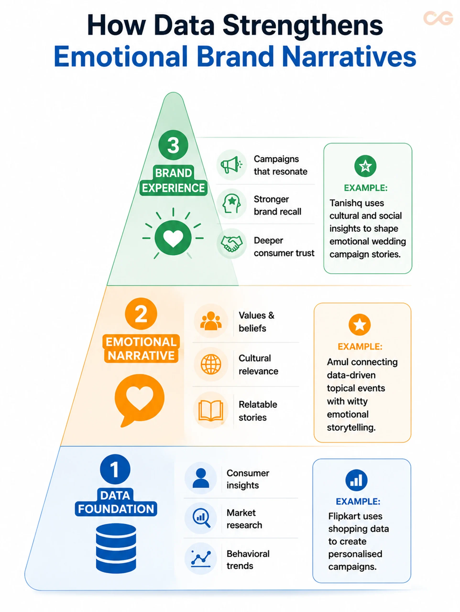
Authentic data-driven stories can make brand storytelling more credible, relatable, and meaningful. When data and creativity work together, data-enabled storytelling allows brands to communicate real customer experiences, demonstrate measurable outcomes, and build stronger connections with their audiences.
Building Trust Through Data
Today’s audiences are increasingly careful about exaggerated marketing claims. Using real data about customer behaviour, challenges, and outcomes gives brand stories greater credibility.
Data storytelling can strengthen trust by:
- Showing, rather than telling: Use customer behaviour and performance data to demonstrate your value proposition instead of relying solely on promotional claims.
- Acknowledging challenges: Present measurable problems alongside the progress or improvements made over time.
- Sharing industry insights: Use credible industry data to provide useful perspectives and establish expertise.
- Highlighting customer outcomes: Support customer success stories with measurable results to make their impact more credible.
Connecting Data with Emotion
Data provides evidence, but emotion gives that evidence meaning. The strongest brand stories combine factual insights with human experiences to help audiences understand not only what happened, but why it matters.
A simple approach is to:
1. Identify the emotion: Decide what you want the audience to feel.
2. Find supporting data: Use credible evidence to reinforce the story.
3. Choose the right context: Present the story at the stage of the customer journey where it is most relevant.
4. Measure the response: Monitor engagement, sentiment, and other relevant audience signals.
Visual Data Storytelling: Bringing Numbers to Life
Data becomes easier to understand when audiences can see the patterns, comparisons, and trends behind the numbers. Visual data storytelling combines data with thoughtful design to communicate insights quickly without overwhelming the audience.
The goal is not to make every data story visually complex. Instead, choose visuals that make the most important insight easier to understand, remember, and act on.
Choosing the Right Visual Format
Different types of data require different visual formats. Choosing the right one can make the difference between a confusing chart and an instantly understandable insight.
- Trends over time: Use line charts or timeline infographics to show changes, growth, or decline over a specific period.
- Category comparisons: Use bar charts, column charts, or comparison tables to highlight differences between products, markets, audiences, or other categories.
- Part-to-whole relationships: Use pie charts, donut charts, or treemaps when you need to show how individual categories contribute to a total.
- Geographic patterns: Use maps or heat maps to reveal differences across regions, cities, or locations.
- Relationships between variables: Use scatter plots or other relationship-based visuals to identify patterns, correlations, or dependencies.
The right visual should answer the audience’s question quickly rather than simply make the content look more attractive.
Designing Data Visuals for Indian Audiences
When creating visual data stories for Indian audiences, consider cultural context, regional diversity , language preferences, and mobile consumption.
- Cultural and regional relevance: Use examples, categories, and data points that reflect India’s diverse markets and consumer behaviours.
- Regional insights: Highlight relevant differences between states, cities, or regions when geographic context adds meaning to the story.
- Mobile-first design: Ensure charts, infographics, and interactive elements remain readable on smaller screens. According to Meltwater, 96 per cent of Indian internet users consume content through mobile devices, making mobile-friendly visualisation particularly important for digital content.
Interactive Features That Increase Engagement
Static visuals can communicate an insight effectively, but interactive elements can encourage audiences to explore the data further. Depending on the platform and audience, consider using:
- Hover effects to reveal additional information without overcrowding the visual.
- Clickable elements that allow users to explore specific data points or categories.
- Animated transitions to guide viewers through changes and developments in the data.
- User-controlled filters that allow audiences to focus on the information most relevant to them.
However, interactivity should serve the story rather than distract from it. If an interactive feature does not help the audience understand or explore an insight, it may not be necessary.
Making Data Visualisations Accessible
Effective visual storytelling should be accessible to as many people as possible. Use sufficient colour contrast, avoid relying on colour alone to communicate meaning, and provide alt text or descriptive explanations where appropriate.
For detailed or complex visualisations, consider providing an accessible data table or text-based summary so audiences can understand the key findings without relying solely on the visual.
Takeaway

From strategy and storytelling frameworks to visualisation and measurement, use this practical checklist to turn your data into stories that engage, inform, and drive action.
How to Implement Data-Driven Storytelling: A Step-by-Step Framework
Turning data into an engaging story requires more than collecting statistics and adding a few charts. Effective data-driven storytelling connects reliable data with audience needs, a clear narrative, relevant visuals, and a meaningful takeaway. A structured approach helps you move from raw information to a story that people can understand, remember, and act on.
1. Define the Purpose of Your Data Story
Start with a clear objective. Determine what you want the audience to understand, what problem the story addresses, and what action you want them to take.
For example, a data story may aim to explain a market trend, highlight a customer problem, support a business decision, or demonstrate the impact of a strategy. Having a defined purpose prevents the story from becoming a collection of unrelated statistics.
2. Understand Your Audience
A compelling data story starts with the audience, not the dataset. Consider what your readers already know, what they care about, and which information will help them make better decisions.
An executive may want the key findings and business implications, while a marketing professional may be more interested in customer behaviour, trends, and campaign performance. Tailor the depth, language, and presentation of your data to the people who will consume it.
3. Collect and Validate Relevant Data
Good storytelling depends on trustworthy evidence. Gather data from reliable and relevant sources, then check its accuracy, timeframe, methodology, and limitations before using it.
Don’t select statistics simply because they support the conclusion you want to present. Unexpected or contradictory findings can sometimes reveal a more valuable story. Being transparent about the limitations of your data also strengthens credibility.
4. Find the Story Behind the Data
Raw numbers don’t automatically make a compelling story. The real value lies in identifying the insight behind those numbers.
Look for:
- Trends that show meaningful changes over time
- Patterns that reveal recurring behaviour
- Comparisons that highlight important differences
- Outliers that challenge expectations
- Relationships that reveal potential connections
- Problems or opportunities that require attention
Once you identify the most important finding, ask a simple question:
Why does this matter to my audience?
The answer becomes the foundation of your story.
5. Build a Clear Narrative
With the key insight identified, give it a logical structure. A simple beginning, middle, and conclusion can make complex information much easier to follow.
Beginning: Introduce the situation, problem, or question.
Middle: Present the relevant evidence and explain what the data reveals.
Conclusion: Connect the insight to its broader meaning and explain what the audience can do with it.
This approach ensures that the audience isn’t simply shown numbers but is guided through the context, insight, and implications behind them.
6. Choose Visuals That Strengthen the Story
The right visual can make a complex insight immediately understandable. Choose your format based on what you need the audience to see rather than choosing a chart simply because it looks attractive.
Use line charts for trends, bar charts for comparisons, maps for geographic patterns, and scatter plots for relationships between variables. For more complex stories, infographics and interactive visualisations can help audiences explore the information at their own pace.
Keep the design focused. Too many charts, colours, labels, or data points can distract from the insight you’re trying to communicate.
7. Explain Why the Insight Matters
Don’t expect your audience to interpret the data on their own. After presenting an important finding, explain what it means in practical terms.
A strong data story answers four questions:
What happened?
Why did it happen?
Why does it matter?
What should happen next?
This context is what turns data storytelling into a decision-making tool rather than simply another form of reporting.
8. Adapt the Story for Different Channels
Your core data story can be adapted for multiple channels without changing its central message.
A detailed blog post can provide the complete analysis, while LinkedIn can focus on a key insight or industry finding. Instagram can turn important statistics into a visual carousel, while email marketing can use one compelling finding to encourage readers to explore the full story.
The data should remain consistent, but the format, length, and level of detail should match the expectations of each platform.
9. Give Your Audience a Clear Next Step
A strong story should leave the audience with more than an interesting statistic. Give them a clear takeaway or action based on what they have learned.
Depending on your objective, this could mean exploring a report, downloading a resource, trying a recommended strategy, contacting your business, or making a specific business decision.
The CTA should feel like a natural continuation of the story rather than an interruption.
10. Measure, Learn, and Optimise
Publishing the story isn’t the end of the process. Measure how people respond and use those insights to improve future content.
Track metrics that match your original objective, such as engagement, shares, leads, conversions, backlinks, or revenue influence. Look beyond individual numbers to understand which topics, formats, visuals, and storytelling approaches generate the strongest response..
This creates a continuous cycle:
Data → Insight → Story → Visualisation → Distribution → Measurement → Optimisation
Over time, this process helps you create data-driven stories that are more relevant to your audience, easier to understand, and more effective at driving engagement.
Going Beyond the Basics: Advanced Data Storytelling Practices
Once the fundamentals are in place, advanced techniques can make data-driven storytelling more interactive, personalised, and engaging.
Predictive Storytelling: Use historical trends and relevant data to explore potential future outcomes through trend analysis, scenario planning, and risk assessment.
Interactive Experiences: Use interactive visualisations, filters, and real-time data to let audiences explore insights based on their interests and needs.
AI-Enhanced Storytelling: AI can help identify patterns in large datasets, generate initial narrative summaries, and support personalisation. Human review is still essential to validate findings and provide context.
Personalised Data Stories: Adapt insights, examples, and narratives to different audience segments to make the story more relevant and engaging.
Responsible Data Use: Protect personal information, use credible sources, acknowledge limitations, and check for bias in datasets and visualisations. Transparent data practices help maintain audience trust.
Common Data Storytelling Mistakes and How to Avoid Them
Even well-researched data-driven storytelling can lose its impact when the data, narrative, or presentation is poorly handled. Recognising common mistakes early can help you create data-driven content that is accurate, engaging, and easier for your audience to understand.
Mistake 1: Using Data for Data’s Sake
The Problem: Including statistics simply because they look impressive, even when they don’t support the central message or provide a meaningful insight.
The Solution: Start with the audience and the story you want to communicate, then identify the data that supports that story. Every statistic should have a clear purpose.
For example: Instead of simply stating that a platform processes 10 million interactions a day, explain what that means for customers, such as helping businesses improve their response time by 35%.
Mistake 2: Overloading the Audience with Information
The Problem: Presenting too many statistics, charts, and insights at once can increase cognitive load and make the main message difficult to follow.
The Solution: Prioritise the most important findings and organise supporting information around them. A simple beginning, middle, and conclusion can help maintain a clear narrative while keeping unnecessary information out of the story.
Mistake 3: Forgetting the Human Element
The Problem: Focusing so heavily on accuracy and analysis that the story becomes disconnected from the people it is meant to reach.
The Solution: Connect important data points to real experiences, customer needs, business challenges, or outcomes. Data provides evidence, while the narrative gives that evidence meaning.
Mistake 4: Using Poor Data Visualisation
The Problem: A chart can be technically accurate and still fail to communicate its message if it is cluttered, misleading, or difficult to interpret.
The Solution: Choose the data visualisation based on the insight you want to communicate. Keep charts simple, use clear labels, maintain appropriate scales, and remove visual elements that don’t add meaning.
Mistake 5: Presenting Data Without Context
The Problem: A statistic without information about its source, timeframe, methodology, or comparison point can easily be misunderstood.
The Solution: Provide enough context for the audience to interpret the finding correctly. Mention the data source, timeframe, relevant methodology, and appropriate benchmarks wherever necessary.
Mistake 6: Ignoring Data Quality and Credibility
The Problem: Using outdated, incomplete, or unreliable data can weaken the credibility of your entire data storytelling effort.
The Solution: Verify your sources before publishing. Check whether the data is current, relevant, and collected using a credible methodology. When using third-party research, clearly attribute the source and avoid presenting estimates as definitive facts.
Takeaway
From strategy and storytelling frameworks to visualisation and measurement, use this practical checklist to turn your data into stories that engage, inform, and drive action.
Digital Marketing Integration: Extending Data Stories Across Channels
A strong data-driven story should not end with a single blog post, report, or presentation. Integrating data storytelling into your broader digital marketing strategy allows you to extend the reach of valuable insights, connect with audiences across different channels, and get more value from the research behind each story.
The key is to adapt the story to each channel rather than simply publishing the same content everywhere.
Cross-Channel Data Storytelling
Different marketing channels can support different stages of your data story:
- Content Marketing: Use the complete research or analysis as a core piece of content, supported by relevant charts, examples, and insights.
- Email Marketing: Highlight one compelling finding or trend and direct subscribers to the full data story for deeper analysis.
- Social Media: Repurpose key statistics, findings, and visuals into carousels, infographics, short videos, or concise data insights. Choose the format based on how audiences interact with each platform.
- Paid Advertising: Use a relevant statistic or research finding as a hook in ad copy and landing pages to introduce a problem, trend, or opportunity.
The objective is not to duplicate the same content across channels. Instead, preserve the core insight while adapting its format, length, and presentation to each audience.
Data Storytelling and SEO
Original and well-researched data can also contribute to your SEO strategy, particularly when the findings provide information that other audiences and publications find valuable.
- Attract backlinks: Original research and unique statistics can encourage other websites and publications to reference your findings.
- Build topical authority: Consistently publishing credible, evidence-based insights can strengthen your expertise around a specific subject.
- Support search visibility: Well-structured data stories can answer relevant questions clearly and provide useful information for both readers and search engines.
However, the goal shouldn’t be to create data stories solely for search rankings. The strongest data-driven content is built around useful insights that audiences genuinely want to understand, reference, and share.
Measuring the Success of Data-Driven Storytelling: Analytics and Insights
Creating a compelling data-driven story is only the beginning. Measuring how audiences respond to it helps you understand what works, identify areas for improvement, and demonstrate its contribution to broader business goals.
The right metrics depend on the purpose of your story. A campaign designed to build awareness will require different measures from one designed to generate leads or support sales.
Set Baseline Metrics
Before launching a data storytelling initiative, establish baseline performance for the channels and content you plan to measure. This gives you a reference point for evaluating whether your stories are improving audience engagement and business outcomes.
Content Engagement Metrics
These metrics help you understand whether audiences are actually interacting with your story:
- Average time on page: Shows how long visitors spend engaging with the content.
- Scroll depth: Indicates how much of a long-form data story audiences consume.
- Social shares: Shows whether readers find the content valuable enough to share with others.
- Comments and interactions: Provide qualitative feedback about audience interest and relevance.
- Email engagement: Track opens, clicks, and other interactions when distributing data stories through email.
Business Impact Metrics
Engagement alone does not show whether your content is contributing to business objectives. Track metrics such as:
- Lead generation: Measures qualified leads generated through data-driven content.
- Conversion rate: Shows how effectively the content encourages the desired action.
- Sales inquiries: Tracks business opportunities influenced by the content.
- Customer lifetime value: Helps assess the long-term value of customers influenced by your content.
- Revenue attribution: Estimates the revenue associated with interactions with your data stories.
Brand Authority Metrics
Data-driven content can also strengthen credibility and industry authority. Relevant indicators include:
- Backlinks from industry publications: Help measure whether other websites consider your research or insights valuable.
- Media mentions and citations: Show how frequently your insights are referenced by external publications.
- Brand awareness: Tracks changes in how familiar your target audience is with your brand.
- Thought leadership perception: Measures whether your audience increasingly views your brand as a knowledgeable and credible source.
- Speaking opportunities: Invitations to industry events can indicate growing recognition and authority.
Choosing the Right Attribution Model
The impact of a data story may not happen immediately. A reader might discover an article today, interact with your brand several times, and convert weeks or months later. This makes attribution more complex.
Depending on your customer journey, consider:
1. First-Touch Attribution:
Credits the first interaction that introduced a prospect to your brand or content.
2. Multi-Touch Attribution:
Considers multiple interactions throughout the customer journey rather than assigning all credit to one touchpoint.
3. Time-Decay Attribution:
Gives greater weight to interactions that occur closer to the final conversion while still recognising earlier touchpoints.
4. Position-Based Attribution:
Places greater emphasis on the first and last interactions while distributing some credit among the interactions in between.
5. Algorithmic Attribution:
Uses data and statistical modelling to estimate which touchpoints contribute most strongly to conversions.
No single attribution model works for every organisation. Choose the approach that best reflects your customer journey, marketing objectives, and available data.
Turning Measurement into Optimisation
Measurement should not be the final step. Use your findings to continuously improve future data stories.
For example:
Low engagement → simplify the introduction or improve the visual presentation.
High engagement but low conversion → strengthen the CTA or connect the story more closely to the audience’s needs.
High sharing and backlinks → identify the insights or formats that generated interest and replicate what worked.
Strong engagement from one audience segment → develop more relevant stories for that segment.
The goal is not simply to collect more metrics. It is to use those insights to make every data-driven story more relevant, engaging, and effective.
People Also Ask: Measurement Questions
When should I measure the success of data-driven storytelling?
Start measuring engagement as soon as the content is published, but allow enough time for meaningful patterns to emerge. Short-term metrics such as views, engagement, and shares can provide early signals, while leads, conversions, and revenue may require a longer measurement period.
Which metric is most important for data storytelling?
There is no single most important metric. The right KPI depends on your objective. Use engagement metrics for awareness, conversion and lead metrics for demand generation, and revenue or attribution metrics when measuring business impact.
Takeaway
From strategy and storytelling frameworks to visualisation and measurement, use this practical checklist to turn your data into stories that engage, inform, and drive action.
Conclusion: Turn Data into Stories That Drive Engagement
Data-driven storytelling is more than presenting statistics through charts and reports. It combines credible data, compelling visuals, and a clear narrative to help audiences understand complex information, connect with meaningful insights, and take action.
The most effective approach is to keep the audience at the centre of the story. Start with a meaningful insight, support it with reliable data, present it clearly, and connect it to a relevant outcome. Then use data visualisation, interactive experiences, and appropriate digital channels to make the story easier to understand and share.
Key Takeaways
- Start with the audience: Identify what your audience needs to understand, solve, or decide before selecting the data.
- Use credible data: Verify sources, provide context, and avoid statistics that do not contribute to the story.
- Make insights visual: Choose charts, graphics, or interactive formats that make important patterns easier to understand.
- Keep the narrative focused: Avoid overwhelming audiences with unnecessary information. Give every data point a clear purpose.
- Measure and improve: Track engagement and business outcomes to understand what works and refine future stories.
- Stay authentic: Let the evidence shape the narrative rather than manipulating data to support a predetermined conclusion.
The objective is not to duplicate the same content across channels. Instead, preserve the core insight while adapting its format, length, and presentation to each audience.
Your Next Step
You don’t need to transform your entire content strategy at once. Start with one existing piece of content, identify a useful dataset or insight, and turn it into a focused story that gives your audience a clear takeaway.
As you gain experience, expand into interactive visualisation, personalised storytelling, and AI-assisted analysis, while continuing to prioritise accuracy, context, and human relevance.
Your data already contains valuable insights. The opportunity is to turn those insights into stories your audience can understand, remember, and act on.